
CASE STUDY 01 — SELF-INITIATED
SONA Sleep System
Most sleep products try to fix your sleep. SONA designs the hour before it — a ritual built from a ceramic dock, scent compositions, a companion app, and a brand, working as one experience.
Industrial Design · CMF · Experience · Brand · Packaging · Prototyping
Sole designer, end to end — concept through to a 49-screen interactive prototype. Visualisation and prototyping produced with AI tools under my direction.
■ CONTEXT
The hour that
got crowded
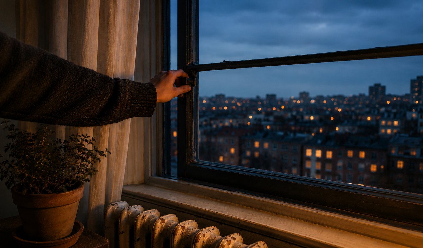
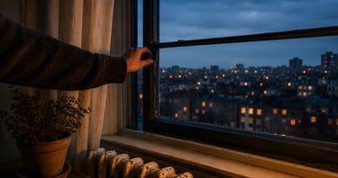
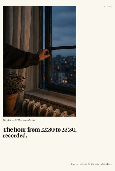
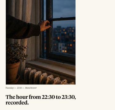
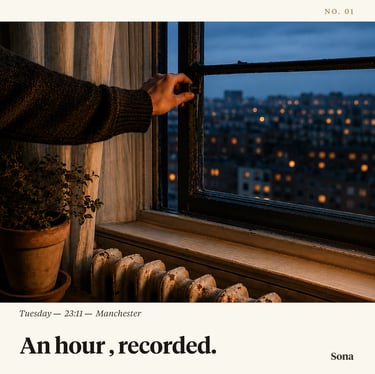
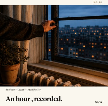
The hour before sleep used to be empty. Now it's the most crowded part of the day — work residue, notifications, one more episode, a scroll that doesn't end.
People reach for sleep trackers and supplements, but those measure or medicate the sleep itself. Almost nothing is designed for the transition into it. That gap is where SONA sits: not a better way to sleep, a way to arrive at it.
■ The problem
A transition problem,
not a sleep problem
Most people who "can't sleep" don't have a sleep problem — they have a transition problem. They can't get from a stimulating day to a quiet enough mind. The wellness market answers this with transformation: streaks, supplements, scores — each asking for more effort at the exact moment a person has none left.
SONA makes the opposite bet: that calm is earned through attention and environment, not motivation. So it isn't a tracker. No sensors, no scores, no streaks.
■ The problem
Designing for a feeling, not a metric
The hour before sleep is when people are least able to begin anything effortful — willpower is spent, attention is fragmented. So any product that asks for input at that hour works against the very state it's trying to create.
The emotional target was narrow and specific: the relief of permission to stop. I designed every part of SONA to produce that one feeling and ask for almost nothing back. And because habits form through repetition and low friction, the ritual had to be the same few actions every night — easy enough to keep on the worst evenings, not just the good ones.
Three rules everything had to pass
Reduce effort at the moment effort is hardest. If a feature added a decision, it had to earn it.
01
Ask less, not more
02
03
Make calm physical
Design it to be left
Light, scent, weight, and material do the work a screen can't. The object carries the feeling.
Success is the phone face-down and the app forgotten — not opened again. Disengagement is the goal.
■ design principles
■ positioning
I set the world before the object
Before drawing a single form, I decided what SONA was not: not a gadget, not a wellness app, not aromatherapy. I built its world from publishing, bookmaking, and still-life photography — editorial, restrained, exact. The palette of ivory, ink, and ochre, the type, and the tone all came from here, and everything downstream inherited them. Positioning made visually, before it was made verbally.
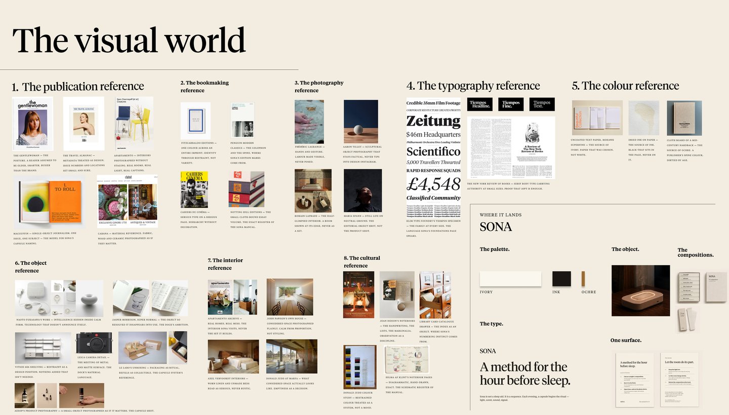

References, palette (ivory · ink · ochre), type, and where SONA lands.
Four parts, one ritual
SONA works because the parts hand off to each other. The compositions set the intent for the evening. The dock makes that intent physical — heat, scent, a low light. The app opens the sequence, then disappears. The brand holds all three in one coherent world. Designed as a system, not a product with accessories.
■ system thinking
■ THE MODEL
Designed around how a ritual actually works
A ritual isn't a single moment — it's a sequence of handoffs. I mapped the transition into five stages, then gave each part of SONA one stage to own.
■ THE SOLUTION — dock
A domestic object,
not a gadget
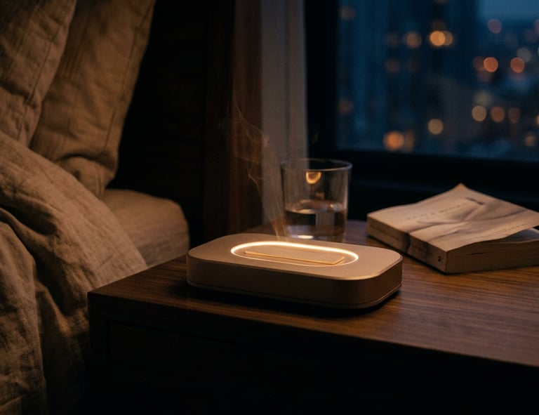
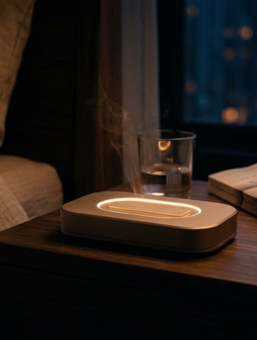
The hardest decision was resisting the obvious one — a sleek tech device. I gave the Dock a ceramic stone body, warm and matte, on a low A6 footprint, so it reads as something you'd own, not something you'd charge.
The real constraint was heat: scent needs warmth, but the object had to be safe and quiet on a bedside table. The answer was a recessed vessel that localises heat where the composition sits and keeps the rest of the body cool to the touch — form and function arguing for the same thing.
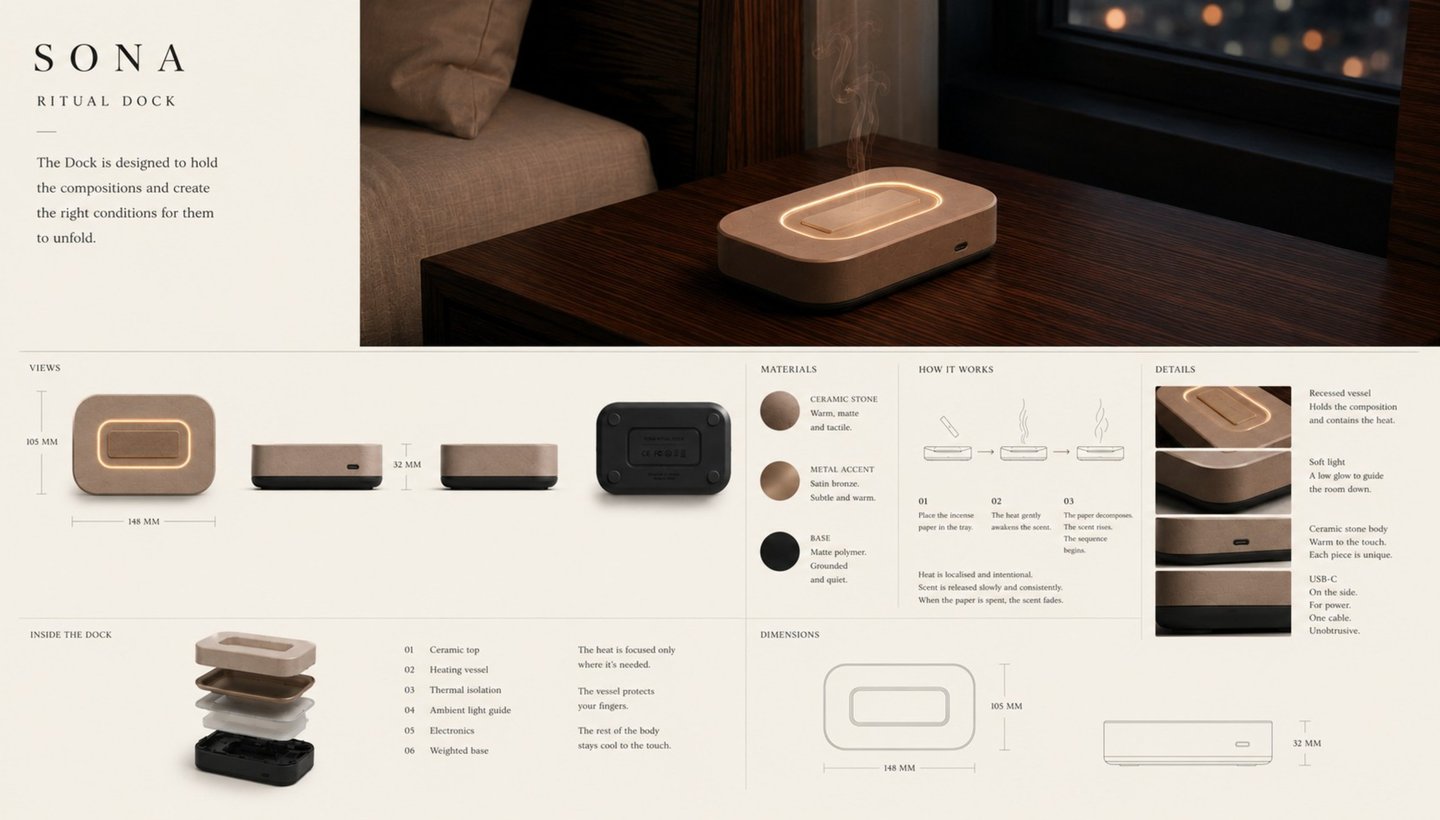
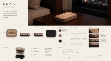
SONA Ritual Dock — form, materials, mechanism, and dimensions.
■ THE SOLUTION — COMPOSITIONS
Packaged like a publication, not a supplement
I explored capsules and fragrance oils first — and rejected both, because each instantly recast SONA as a supplement or an aromatherapy product. I moved to incense papers in a linen-wrapped box, indexed like a small publication: seven compositions, each for a different kind of evening, drawn across a 28-night cycle. The packaging does positioning work the product can't — it tells you, before you've used anything, that this is a ritual you keep, not a treatment you take.
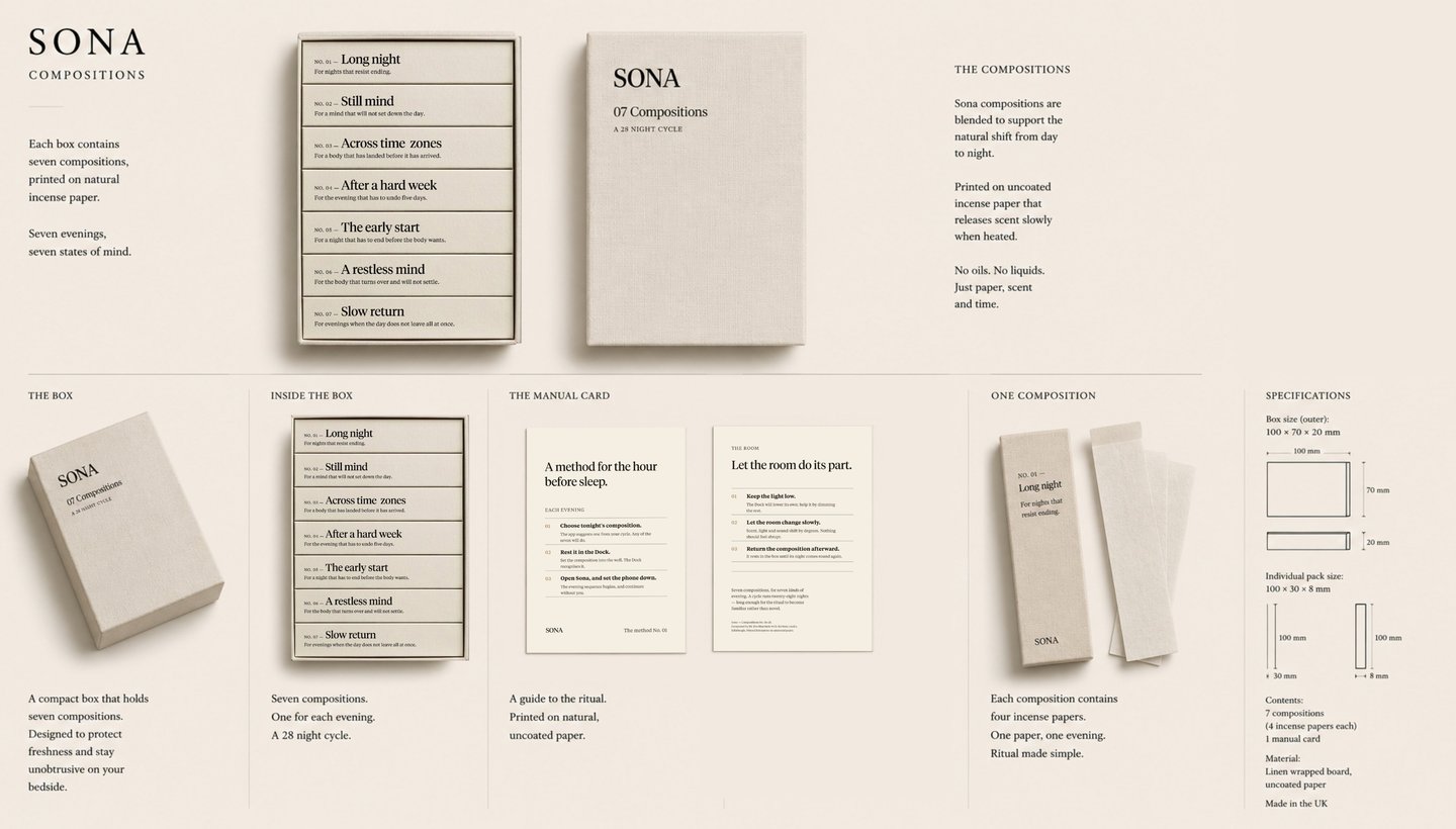
Seven evenings, seven states of mind — a 28-night cycle.
■ THE MODEL
Designed around how a ritual actually works
A ritual isn't a single moment — it's a sequence of handoffs. I mapped the transition into five stages, then gave each part of SONA one stage to own.
The interface is busiest at the start and silent by the end. The design goal was the last step: getting the phone out of your hand.
Google font which is smiliar to Teimpos Font is used for prototyping purpose as Teimpos is available for testing purpose only.
■ brand & campaign
An editorial voice for calm
The identity and launch campaign hold the same line as the product: unhurried, exact, closer to a publication than a brand. The campaign sells a feeling — the hour before sleep — not a feature. Across web, social, and print, the voice never raises itself.
A1 size poster
Linkedin Square post
Instagram feed post/story
Campaign across formats — web, social, and print.
■ impact — how I'd measure it
What "working" would look like
SONA is a concept, so these are signals I'd validate — not results I'm claiming. Each one measures a behaviour, not a vanity number.
■ REFLECTION
What it proves,
and where it goes next
SONA is a self-initiated concept, and I've been deliberate about what that means. It proves I can hold a single idea — earned calm — across an object, a scent system, an interface, and a brand without it fracturing.
What I'd test next is the part a concept can't answer alone: whether the ritual survives contact with tired, distracted people over a full 28-night cycle. That's the study I'd run first — small, qualitative, in real bedrooms — before any tooling or engineering. Designing the restraint was harder than designing features. Knowing what to leave out is the part I'm proudest of.
■ ROLE & SCOPE
What I made
Sole designer, end to end: problem framing, concept and form development, CMF, app UI and flows, brand identity and visual system, packaging, and launch campaign — brought together as a 49-screen interactive prototype.
Self-initiated, designed in the UK. Concept, product direction, experience and art direction are mine; visualisation and prototyping were produced with AI tools under my direction.
■ NEXT PROJECT