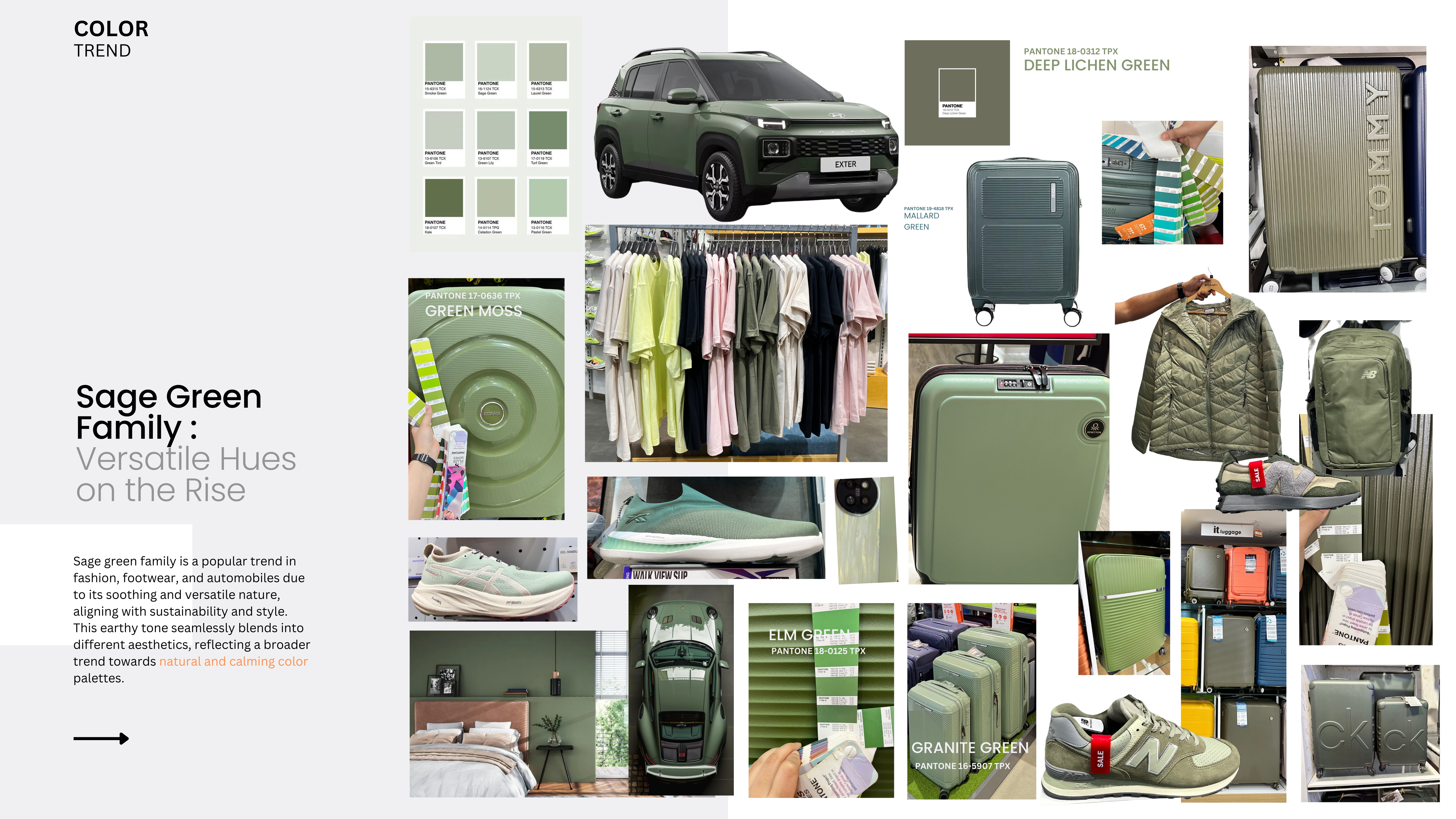
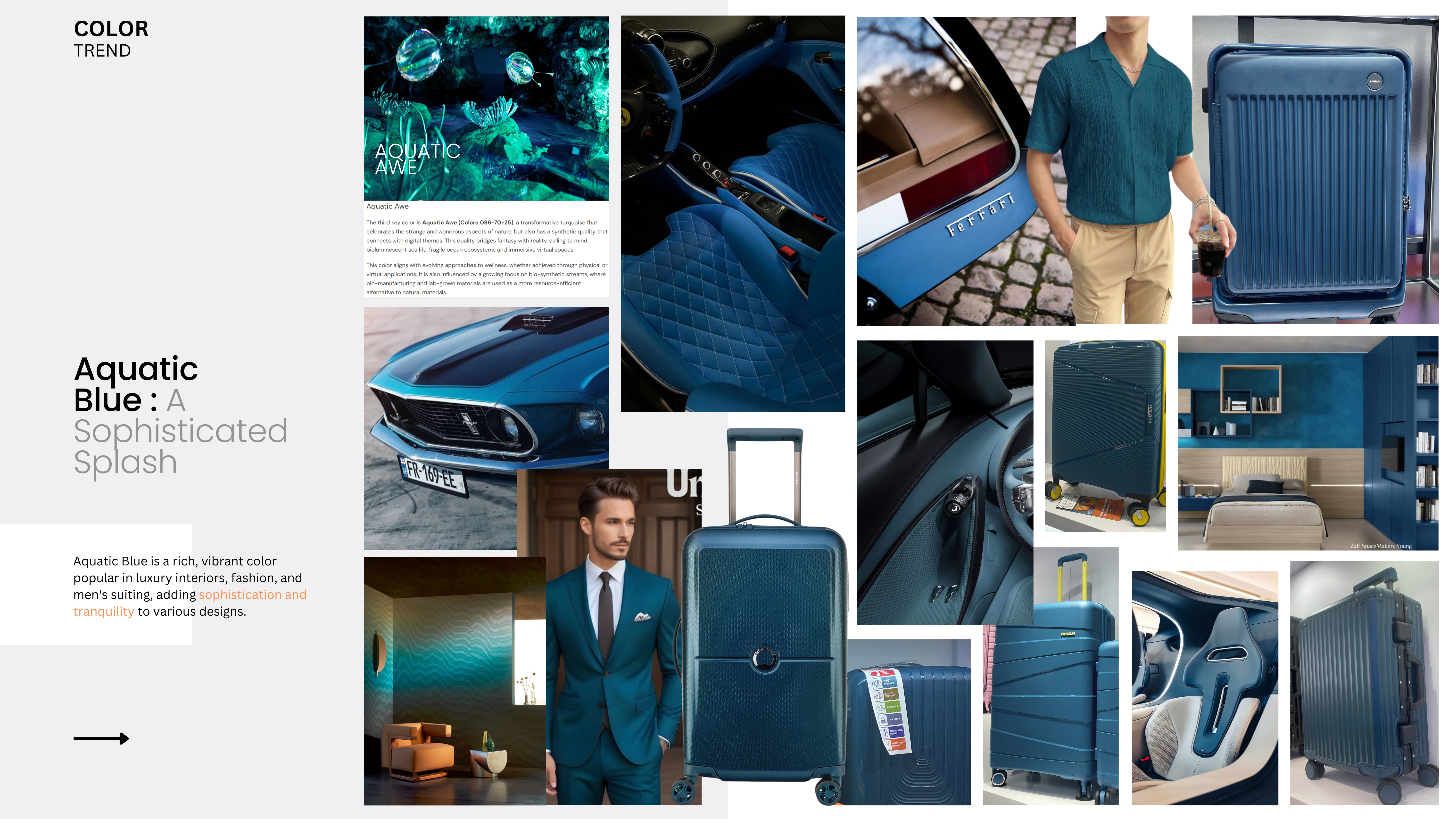
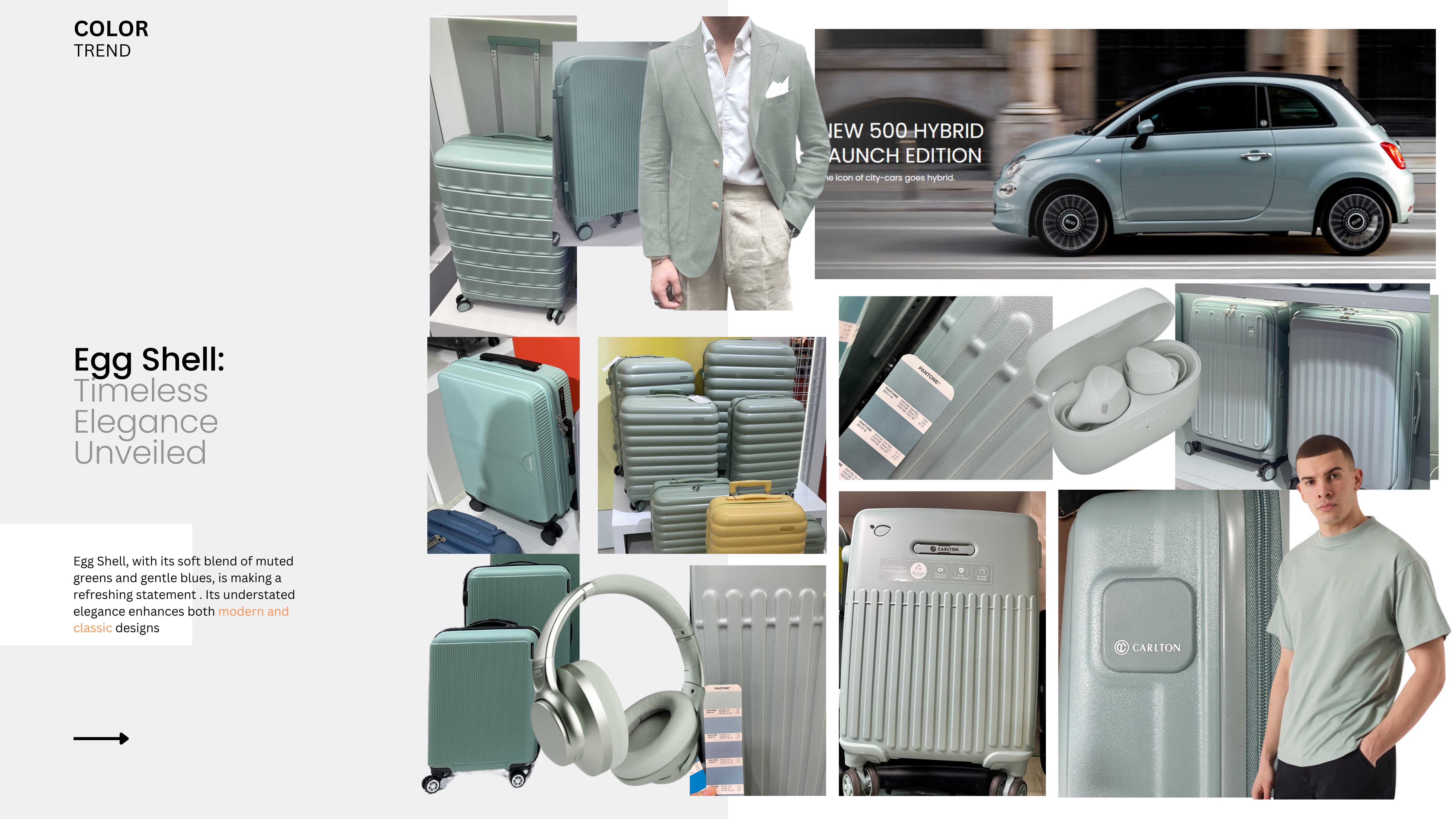
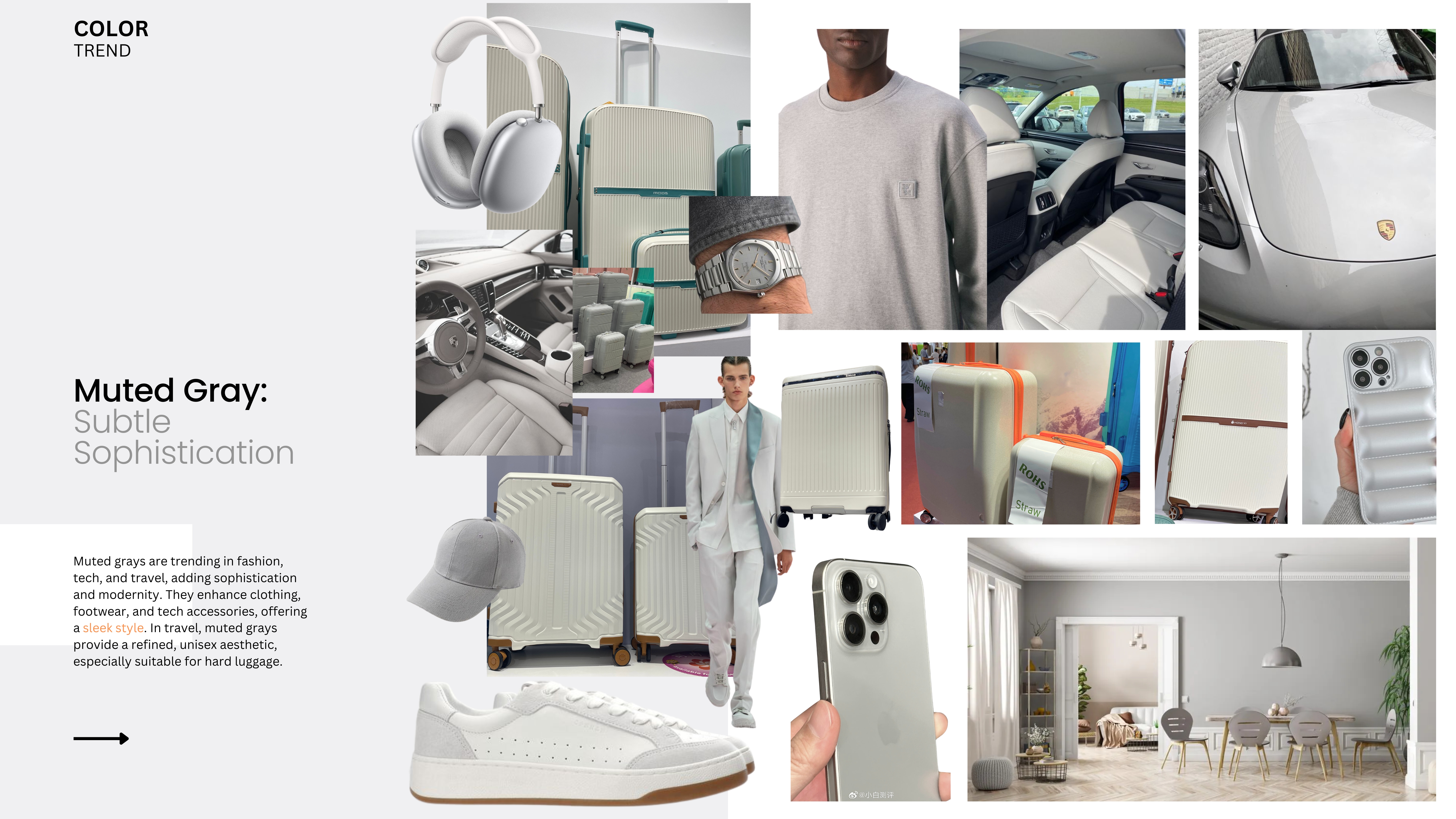
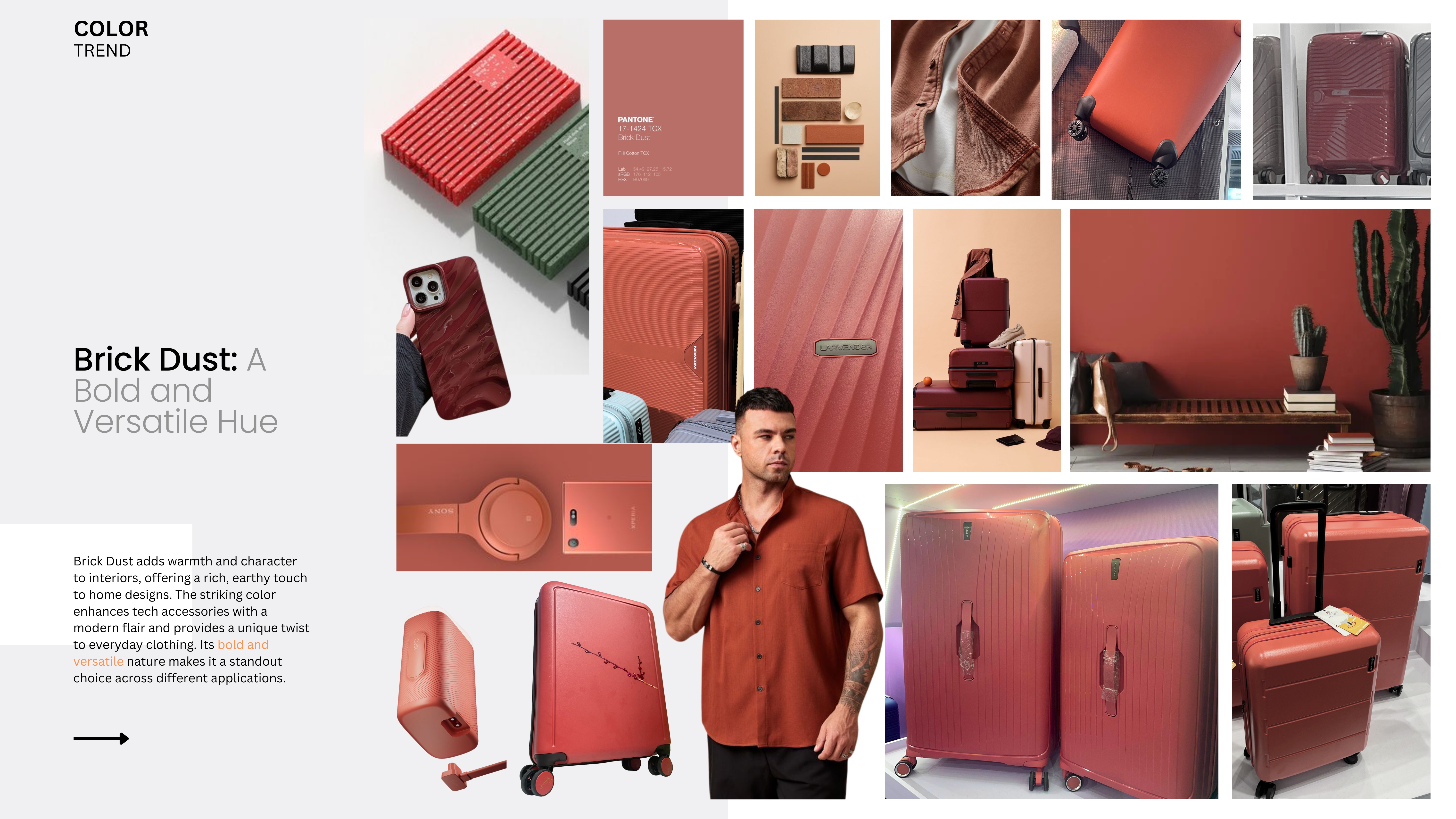
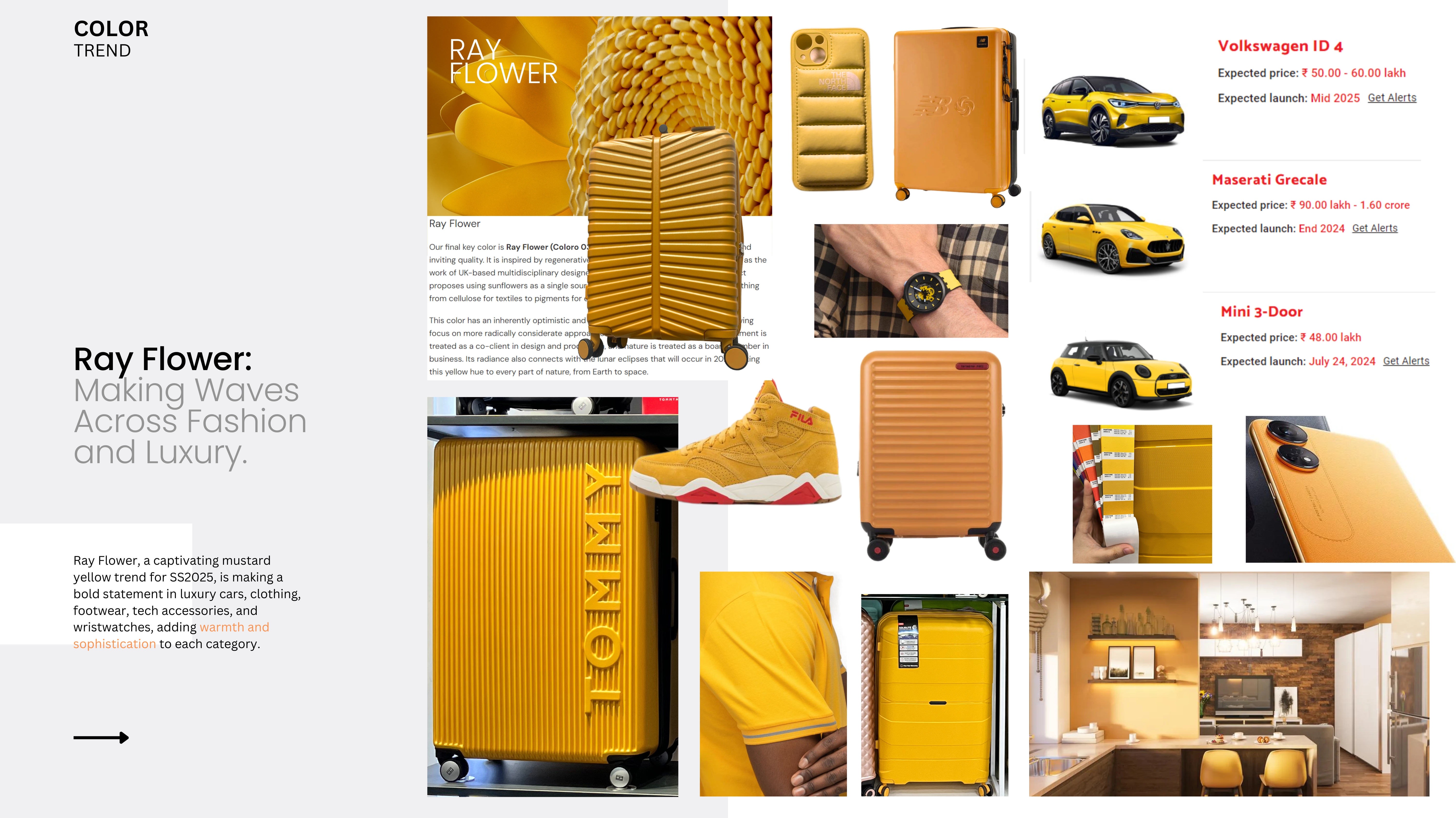
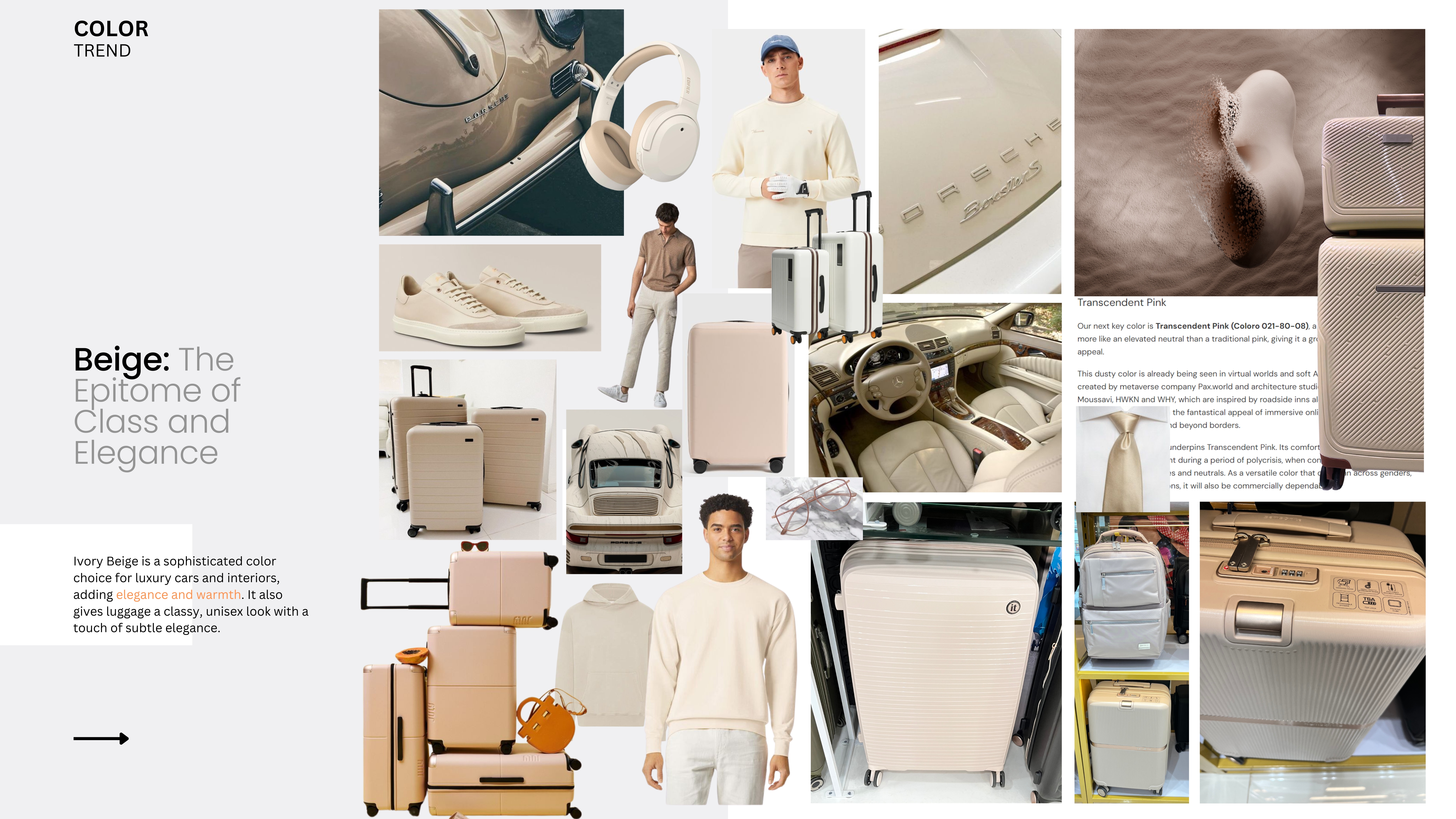
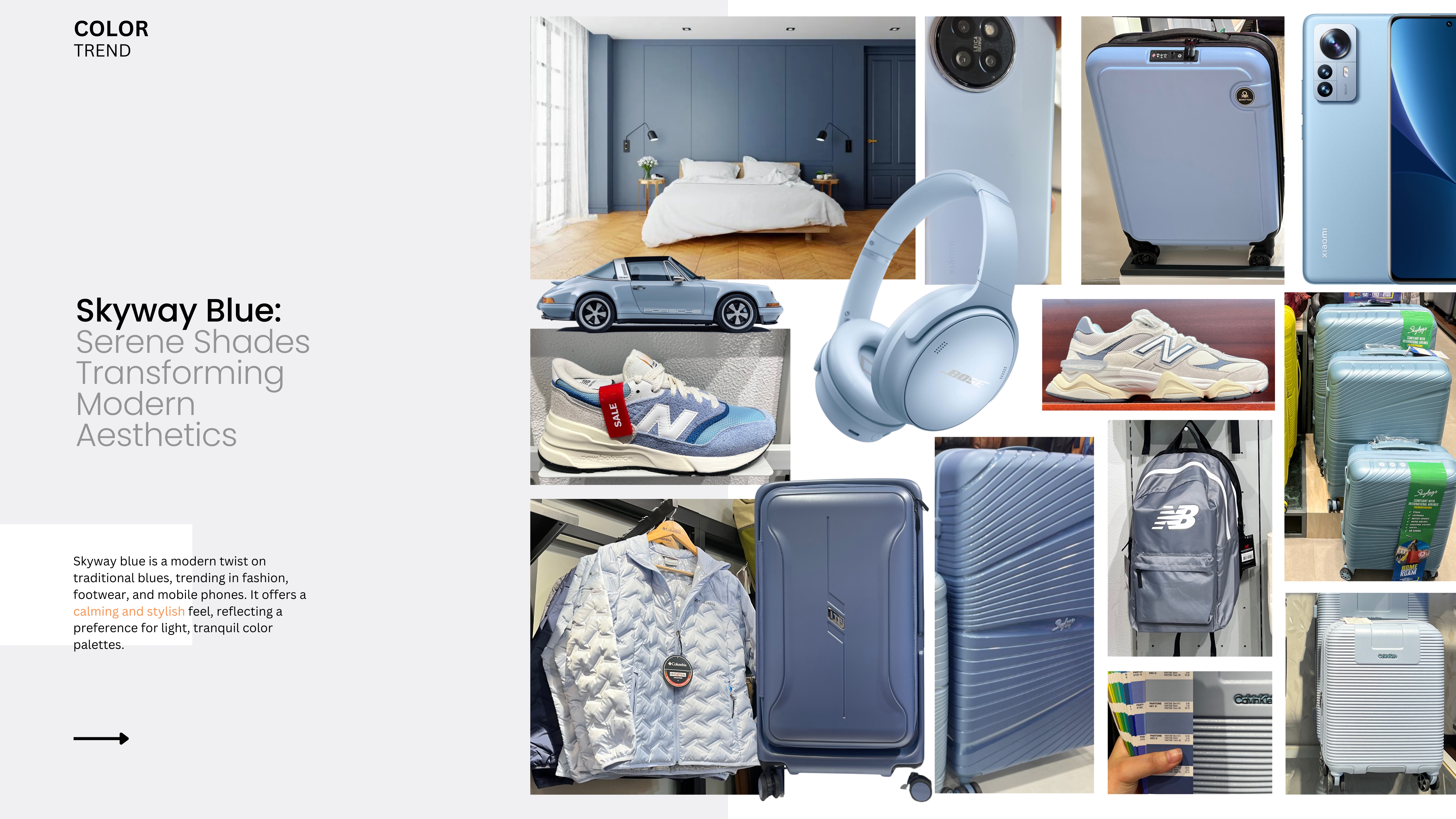
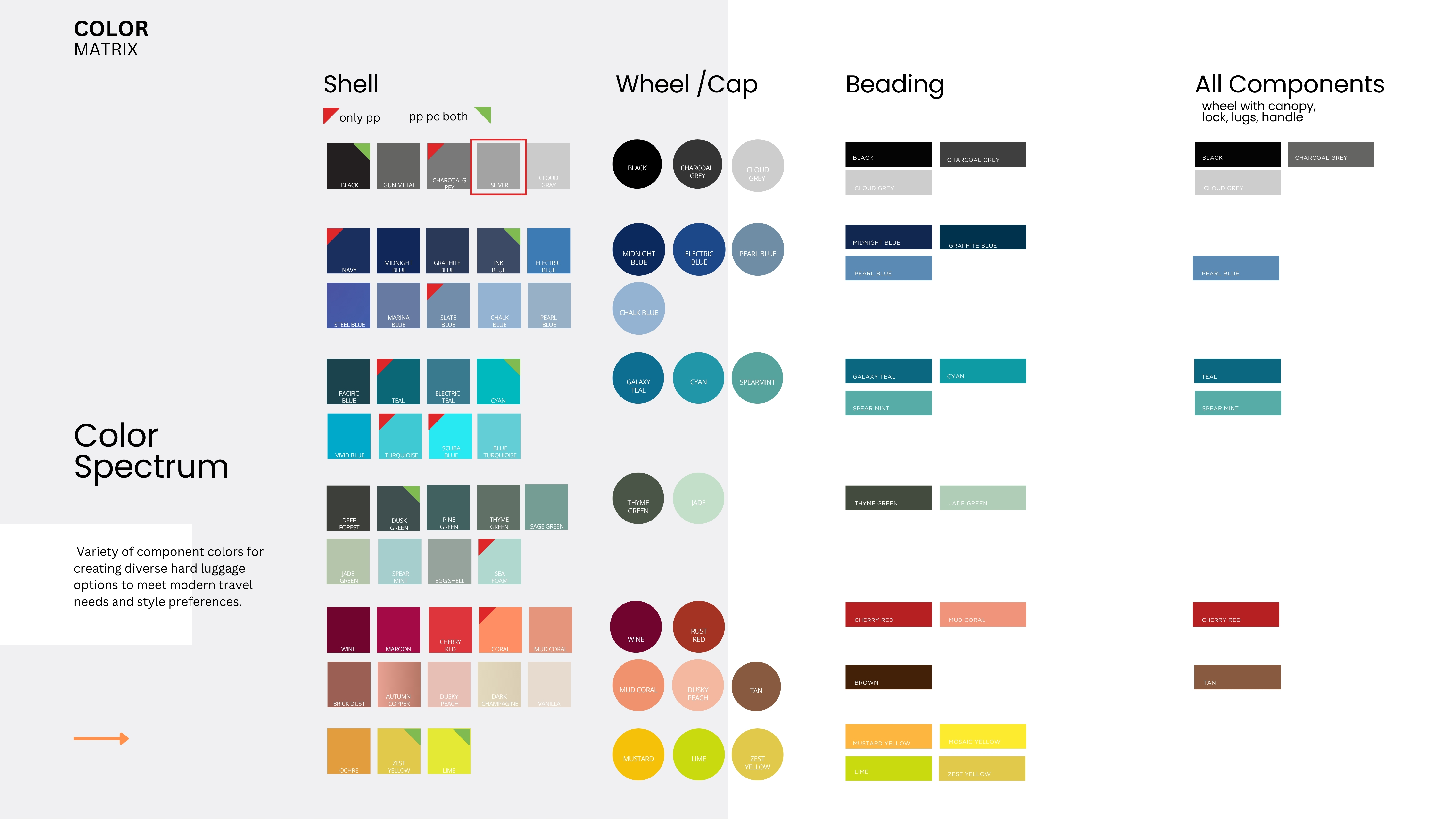
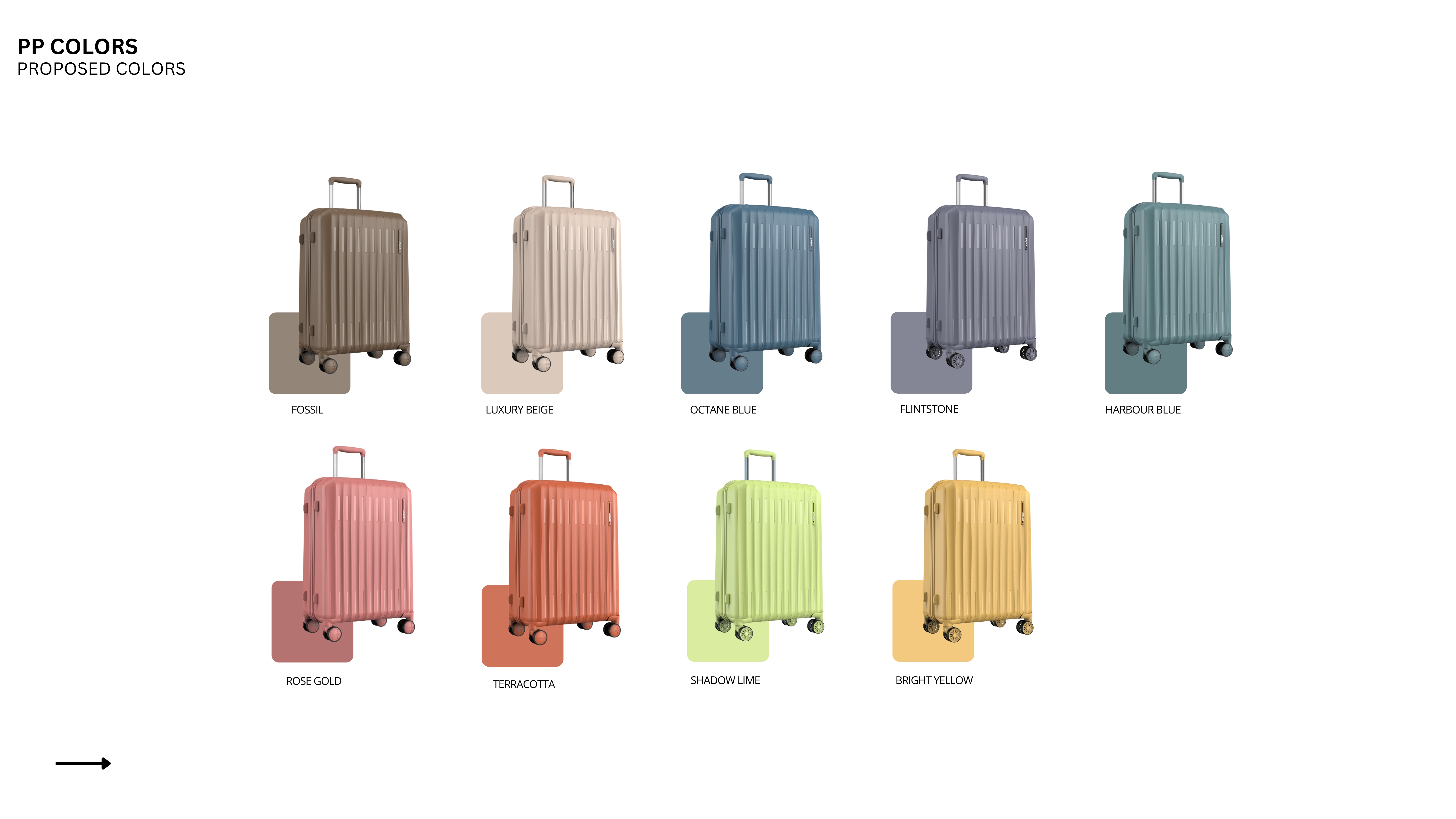
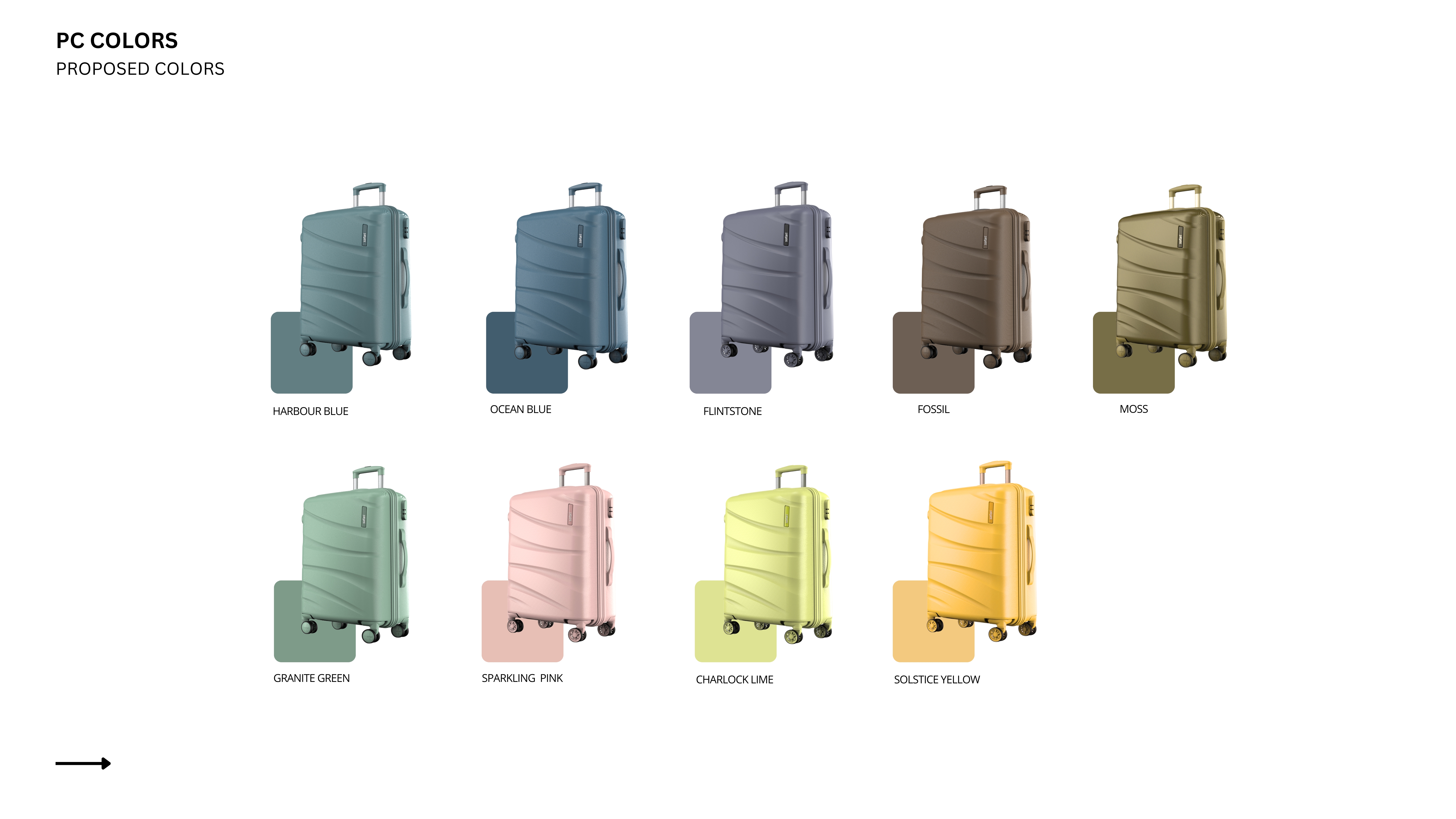
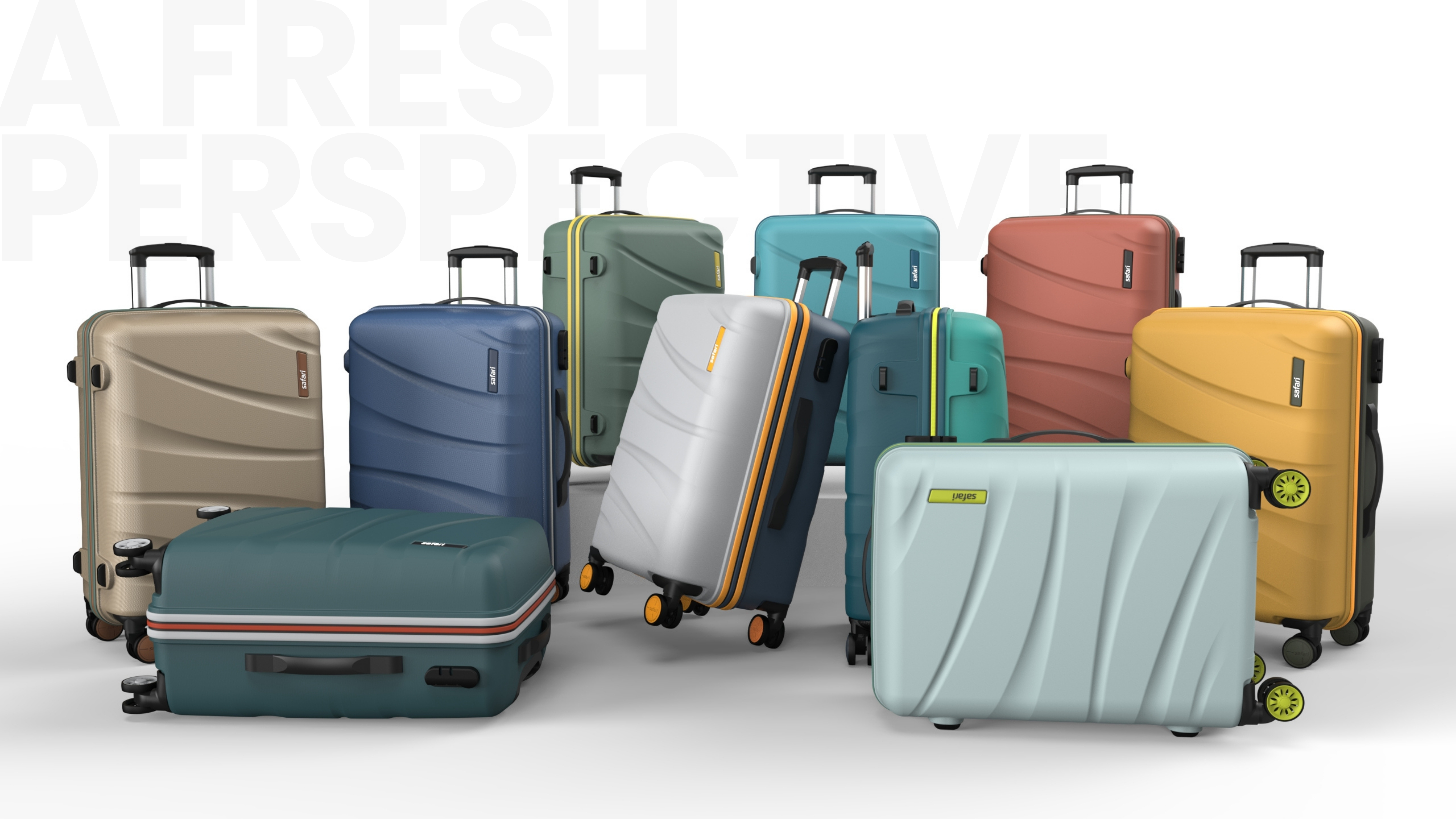
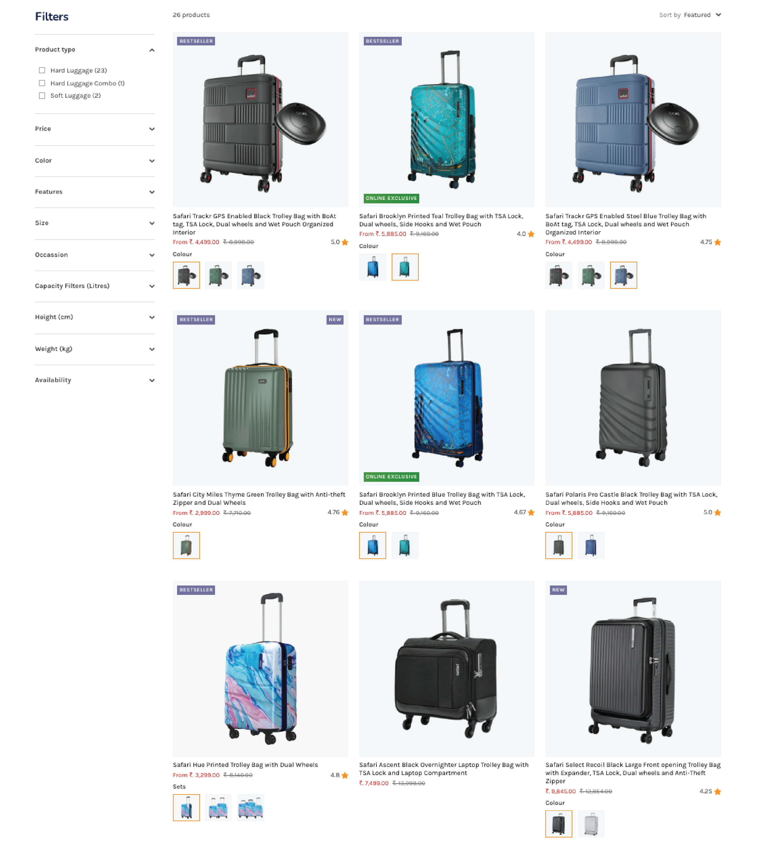
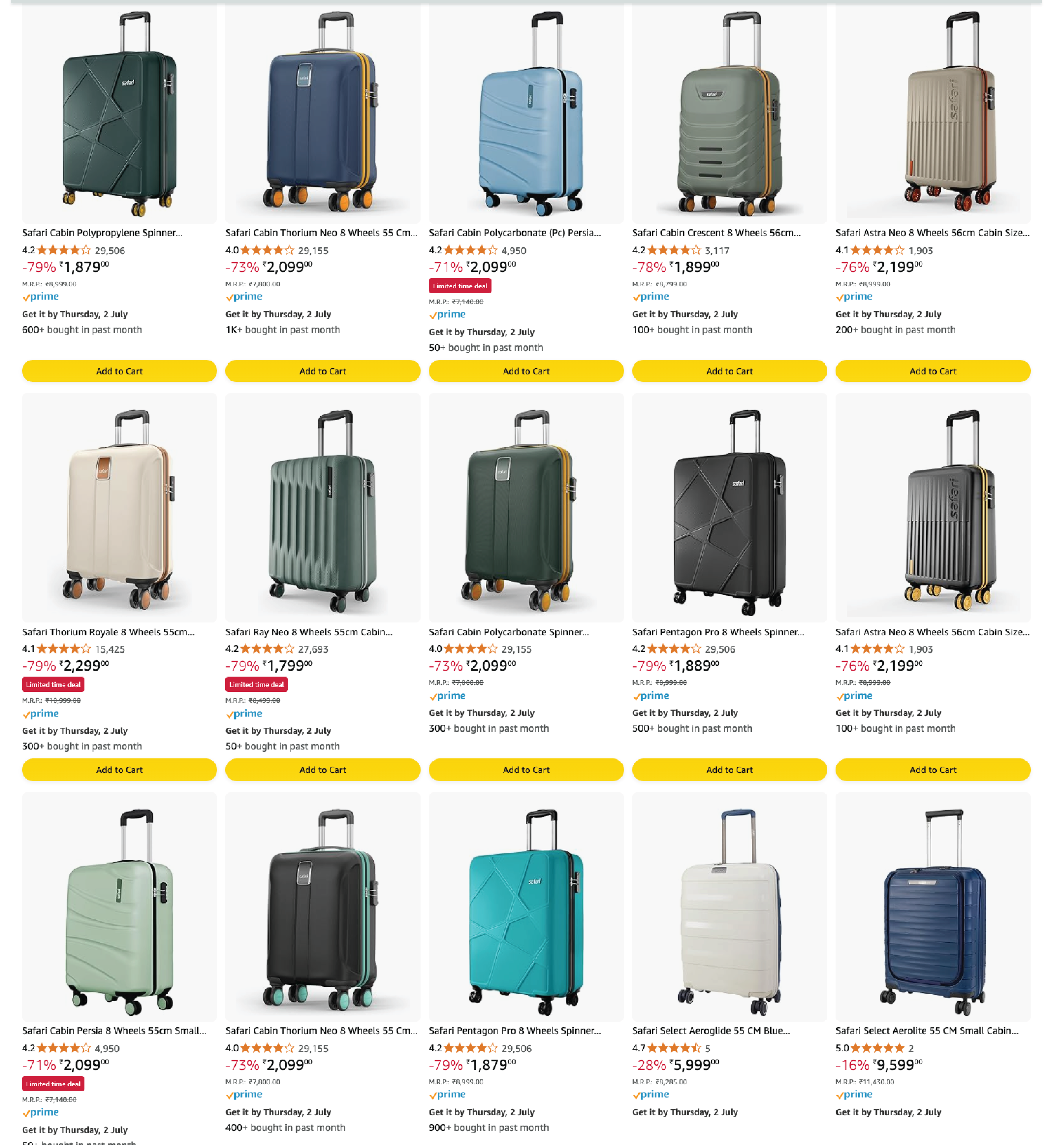
By 2024, Safari's range had narrowed into four colour territories — black, blue, grey, and teal. Reliable on volume. Recognisable on shelf. And, increasingly, a problem.
Two signals were arriving from the field at the same time. Dealer feedback came in from every market visit: the same request, every time — new colours. The trade was telling us the existing palette was tapped out. They needed reasons to refresh shelf, reasons to call a buyer back, reasons to pitch a Safari range against the brighter, more expressive competitors arriving in their stores.
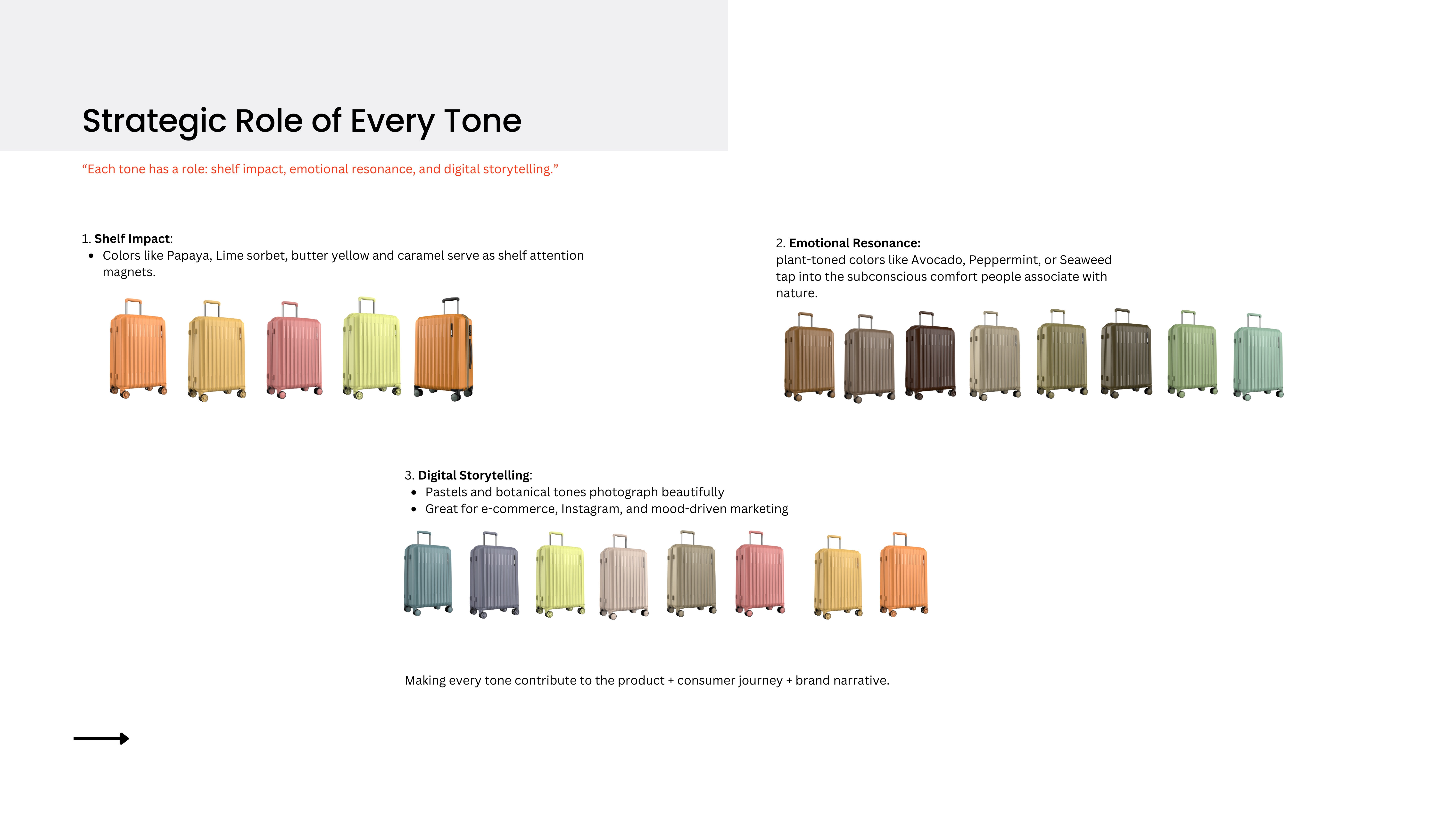
The second signal was the consumer the trade was reacting to: a younger buyer who had stopped choosing luggage the way her parents had. She wasn't picking a black suitcase because it was practical; she was picking an orange one because it said something. And the brands she was picking weren't Safari — they were the ones offering eye-catching, expressive colour. We were losing her on the colour wall, before she ever read the spec sheet.
The category-level truth was that hardshell luggage is largely commoditised. The same polycarbonate shells, the same wheel systems, the same trolley mechanisms move through dozens of brands. Once shape and size are set, colour is the choice the consumer is actually making. Safari was still treating it as a finishing decision.
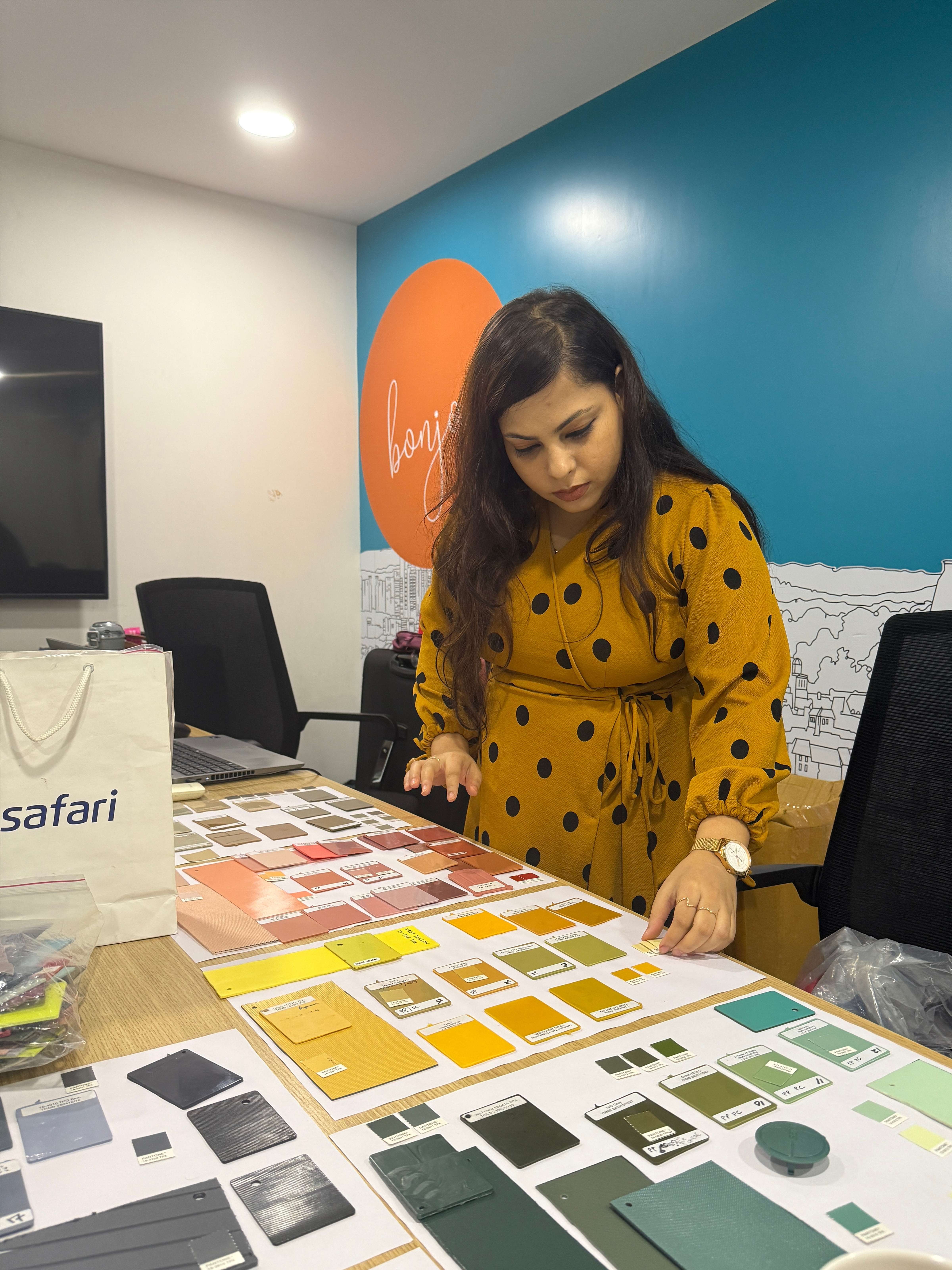
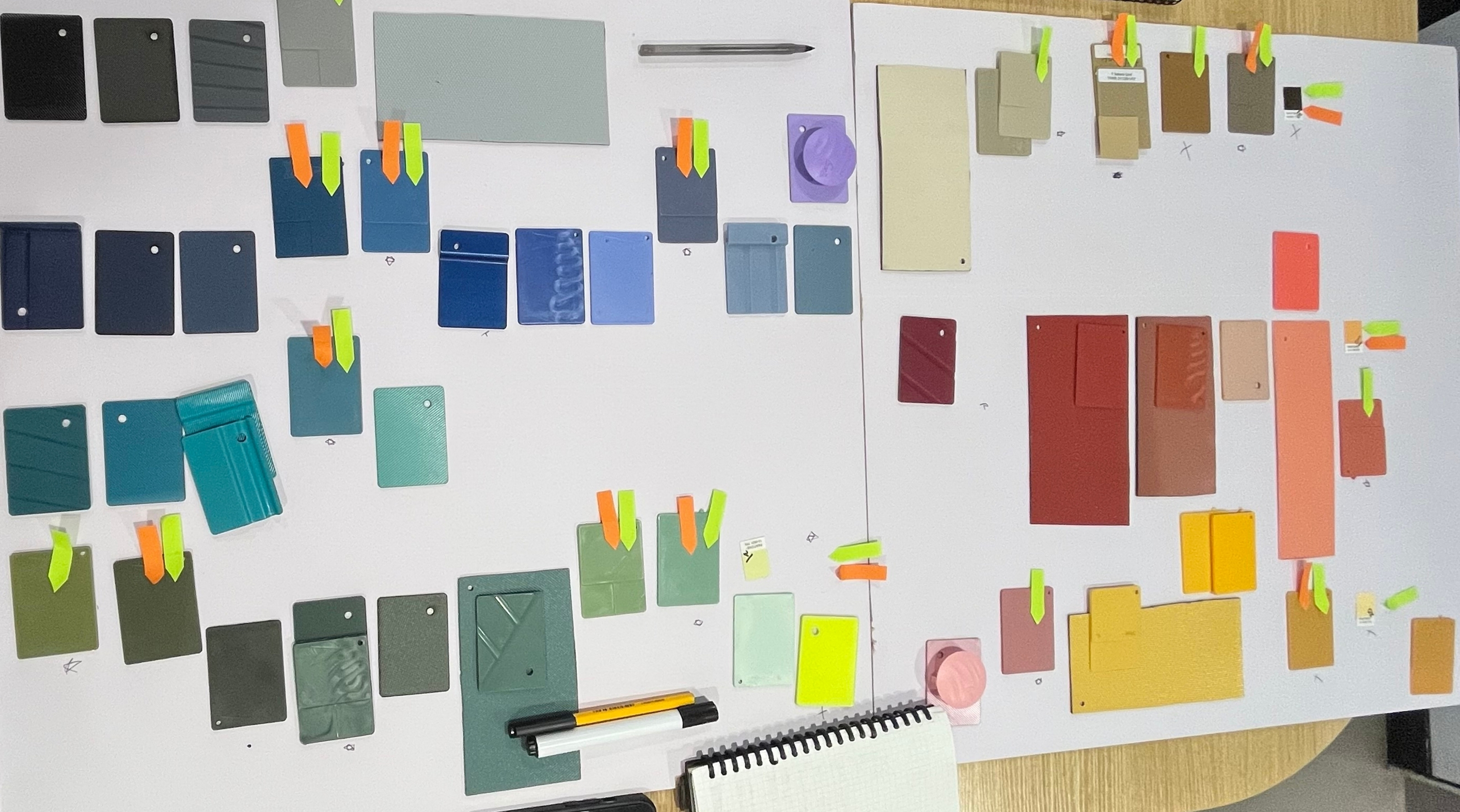
Colour Quest started from one position: if colour is the choice the customer is making, the brand has to direct it deliberately, season on season, with the same rigour we apply to form.